Group Ordering for shared meals
Ordering food as a group can often be time-consuming and confusing. Often times, people struggle with:
Sharing links or coordinating who adds what
Managing split payments
Ensuring everyone's items arrive together
So as a Product Designer, how can we create a seamless, collaborative ordering experience that minimizes delay and maximizes convenience for groups?
Year:
2025
Tools:
Figma, FigJam, Notion, Maze
Role:
Product Designer & Researcher
Project Duration:
8 Weeks

Design Process :
Research
Competitor Analysis
User Personas & Interviews
User Journey
The Design
Learnings & Strategy
Research
Using the information gathered from the users I've interviewed that actively uses DoorDash in a group setting. Participants included 20-30 users (students, co-workers, friends) who order food through DoorDash 2-4x a week.
0%
0%
of users said coordinating group orders is stressful
0%
0%
rely of texting to confirm who added which order
0%
0%
rely of texting to confirm who added which order
0%
0%
would use a group ordering feature if built in
0%
0%
worry about covering friends who forget to pay
COMPETITIVE ANALYSIS :
Key Findings:
DoorDash: Has "Group Orders" but lacks visibility on who added what and individual payments
Uber Eats: Allows shared cart but no real-time progress tracking
Postmates: No group features
Opportunity: Design a collaborative, transparent, and payment-flexible system that enhance the social side of ordering together.

User PErsona and Interviews :
Using the information gathered from the users I've interviewed that actively uses DoorDash in a group setting. The persona developed was also used as a guide for specific participants needed for the usability testing portion of the design process. The User Persona's mainly focused on willing participants who typically took charge of ordering for their groups.


User Journey & Opportunities identified :
I mapped the group ordering journey from invitation to checkout and identified key friction points:
"Users struggled to coordinate additions and payments,"
"Communication overhead delayed order placement"
This led to an opportunity to design real-time status indicators and inline payment splits, directly influencing the next iteration of wireframes.

dESIGNS :
Design decisions & Trade offs:
Centralized group cart vs. individual carts:
Centralized cart allowed everyone to see and edit the full order in real time, but risked overwhelming users with too much information
Individual carts minimized cognitive load per user but caused confusion when merging orders at checkout.
Decision: I implemented a centralized cart with progressive disclosure of details, balancing visibility with simplicity.
Real-time order updates vs. periodic refresh:
Real-time updates ensured everyone had the latest information instantly but increased technical complexity with potential sync issues.
Periodic refresh simplified implementation but risked stale information causing errors
Decision: I opted for real-time updates with visual indicators to highlight changes, prioritizing user coordination over technical simplicity.
Fee splitting at checkout vs. per-item contribution:
Per-item contribution gave users precise control but complicated the interface
Checkout-level fee splitting simplified the process but reduced flexibility
Decision: I chose checkout-level splitting to keep the flow straightforward, while adding inline transparency to show who owes what
Outcome: These tradeoffs allowed the feature to reduce friction in group coordination, maintain usability for new users, and increase the likelihood of completed multi-person orders.
Low Fidelity Wireframes :
I developed digital sketches of the preliminary design decisions. These concepts were reviewed and tested with users to ensure their needs were met with the feature.


High Fidelity Wireframes :
I developed digital sketches of the preliminary design decisions. These concepts were reviewed and tested with users to ensure their needs were met with the feature.

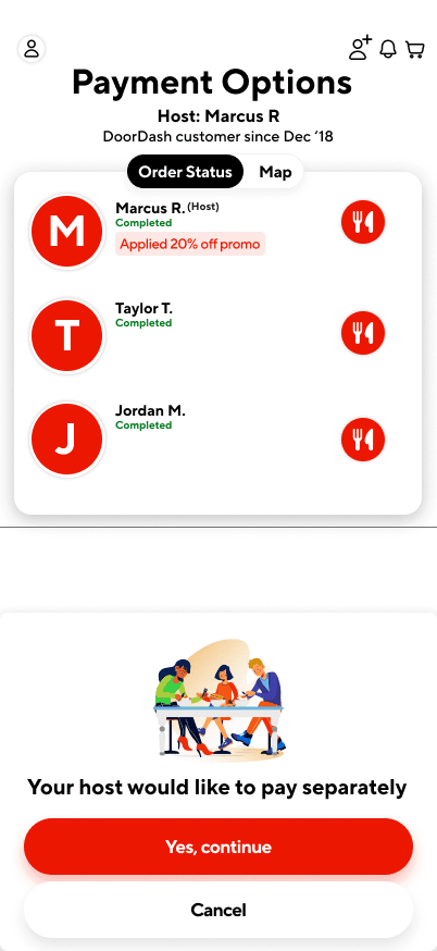

Redesigning the Doordash progress bar :
This is the real-time DoorDash progress bar design I ultimately chose. It incorporates visual indicators to clearly communicate state changes, prioritizing user clarity and coordination over technical simplicity.

design System Components :
I designed this feature within DoorDash’s existing design system, creating scalable components to support group ordering while maintaining visual and functional consistency.


The design :
Some of the users who were interviewed at the initial stage were asked to share their experiences and feedback through the new designed feature for DooorDash.
Whats new :
Gamifying the Tracker: Users enjoyed watching the group feature actively track users orders within the application and appreciated that it also updated the cost of items as well
Live Tracking for group participants: Users felt that this feature was needed to keep track of colleagues/friends orders to ensure that everyone receives their order simultaneously
Options to split payments: For the users who are typically the ones to charge their cards for DoorDash orders, users believed that this feature would be necessary for future group food coordination efforts
Final Result :

Improvements
Prototype usability testing showed a 40% reduction in task time and 85% satisfaction. If implemented, we estimate this could lead to higher group-order conversion and average order value.
0%
0%
reduced group order completion time
0%
0%
improved user satisfaction by
0%
0%
rely of texting to confirm who added which order
Increased trust through clear payment transparency
group ordering drop-off
Out of 100 group order starts:
Prototype usability testing showed a 40% reduction in task time and 85% satisfaction. If implemented, we estimate this could lead to higher group-order conversion and average order value.
0
0
reach the payment option
0
0
successfully place the order
0%
0%
rely of texting to confirm who added which order
PRIMARY drop off points:
Restaurant selection
Payment Clarity
Coordination delays
Learnings & Strategy :
The design thinking approach ensures that the final output of this feature is human-centered. While answering, "is this what users want?" "What will help ease their journey?" Along with the fact that customer expectations continue to grow for DoorDash, it would be beneficial to continue to adapt and ideate the feature.
DoorDash is a growing cooperation, so in response, UX designers will have to analyze the requirements needed to ensure that the company continues to meet users needs, identify any gaps and continue to provide a solution to help with the usability of the application.
But what's next for the Case Study? Personally, as a User Experience designer who's growing their skills in User Interface Design as well, I'm diving into animating the wireframe and providing different solutions to help the ease of user of the DoorDash application overall.
Next Steps:
Explore integrating Venmo and Apple Pay APIs
Introduce a group chat or reactions for engagement
Design admin controls for large group orders (5+ people)
Group Ordering for shared meals
Ordering food as a group can often be time-consuming and confusing. Often times, people struggle with:
Sharing links or coordinating who adds what
Managing split payments
Ensuring everyone's items arrive together
So as a Product Designer, how can we create a seamless, collaborative ordering experience that minimizes delay and maximizes convenience for groups?
Year:
2025
Tools:
Figma, FigJam, Notion, Maze
Role:
Product Designer & Researcher
Project Duration:
8 Weeks
Design Process :
Research
Competitor Analysis
User Personas & Interviews
User Journey
The Design
Learnings & Strategy
Research
Using the information gathered from the users I've interviewed that actively uses DoorDash in a group setting. Participants included 20-30 users (students, co-workers, friends) who order food through DoorDash 2-4x a week.
0%
0%
of users said coordinating group orders is stressful
0%
0%
rely of texting to confirm who added which order
0%
0%
rely of texting to confirm who added which order
0%
0%
would use a group ordering feature if built in
0%
0%
worry about covering friends who forget to pay
COMPETITIVE ANALYSIS :
Key Findings:
DoorDash: Has "Group Orders" but lacks visibility on who added what and individual payments
Uber Eats: Allows shared cart but no real-time progress tracking
Postmates: No group features
Opportunity: Design a collaborative, transparent, and payment-flexible system that enhance the social side of ordering together.
User PErsona and Interviews :
Using the information gathered from the users I've interviewed that actively uses DoorDash in a group setting. The persona developed was also used as a guide for specific participants needed for the usability testing portion of the design process. The User Persona's mainly focused on willing participants who typically took charge of ordering for their groups.
User Journey & Opportunities identified :
I mapped the group ordering journey from invitation to checkout and identified key friction points:
"Users struggled to coordinate additions and payments,"
"Communication overhead delayed order placement"
This led to an opportunity to design real-time status indicators and inline payment splits, directly influencing the next iteration of wireframes.
dESIGNS :
Design decisions & Trade offs:
Centralized group cart vs. individual carts:
Centralized cart allowed everyone to see and edit the full order in real time, but risked overwhelming users with too much information
Individual carts minimized cognitive load per user but caused confusion when merging orders at checkout.
Decision: I implemented a centralized cart with progressive disclosure of details, balancing visibility with simplicity.
Real-time order updates vs. periodic refresh:
Real-time updates ensured everyone had the latest information instantly but increased technical complexity with potential sync issues.
Periodic refresh simplified implementation but risked stale information causing errors
Decision: I opted for real-time updates with visual indicators to highlight changes, prioritizing user coordination over technical simplicity.
Fee splitting at checkout vs. per-item contribution:
Per-item contribution gave users precise control but complicated the interface
Checkout-level fee splitting simplified the process but reduced flexibility
Decision: I chose checkout-level splitting to keep the flow straightforward, while adding inline transparency to show who owes what
Outcome: These tradeoffs allowed the feature to reduce friction in group coordination, maintain usability for new users, and increase the likelihood of completed multi-person orders.
Low Fidelity Wireframes :
I developed digital sketches of the preliminary design decisions. These concepts were reviewed and tested with users to ensure their needs were met with the feature.
High Fidelity Wireframes :
I developed digital sketches of the preliminary design decisions. These concepts were reviewed and tested with users to ensure their needs were met with the feature.
Redesigning the Doordash progress bar :
This is the real-time DoorDash progress bar design I ultimately chose. It incorporates visual indicators to clearly communicate state changes, prioritizing user clarity and coordination over technical simplicity.
design System Components :
I designed this feature within DoorDash’s existing design system, creating scalable components to support group ordering while maintaining visual and functional consistency.
The design :
Some of the users who were interviewed at the initial stage were asked to share their experiences and feedback through the new designed feature for DooorDash.
Whats new :
Gamifying the Tracker: Users enjoyed watching the group feature actively track users orders within the application and appreciated that it also updated the cost of items as well
Live Tracking for group participants: Users felt that this feature was needed to keep track of colleagues/friends orders to ensure that everyone receives their order simultaneously
Options to split payments: For the users who are typically the ones to charge their cards for DoorDash orders, users believed that this feature would be necessary for future group food coordination efforts
Final Result :
Improvements
Prototype usability testing showed a 40% reduction in task time and 85% satisfaction. If implemented, we estimate this could lead to higher group-order conversion and average order value.
0%
0%
reduced group order completion time
0%
0%
improved user satisfaction by
0%
0%
rely of texting to confirm who added which order
Increased trust through clear payment transparency
group ordering drop-off
Out of 100 group order starts:
Prototype usability testing showed a 40% reduction in task time and 85% satisfaction. If implemented, we estimate this could lead to higher group-order conversion and average order value.
0
0
reach the payment option
0
0
successfully place the order
0%
0%
rely of texting to confirm who added which order
PRIMARY drop off points:
Restaurant selection
Payment Clarity
Coordination delays
Learnings & Strategy :
The design thinking approach ensures that the final output of this feature is human-centered. While answering, "is this what users want?" "What will help ease their journey?" Along with the fact that customer expectations continue to grow for DoorDash, it would be beneficial to continue to adapt and ideate the feature.
DoorDash is a growing cooperation, so in response, UX designers will have to analyze the requirements needed to ensure that the company continues to meet users needs, identify any gaps and continue to provide a solution to help with the usability of the application.
But what's next for the Case Study? Personally, as a User Experience designer who's growing their skills in User Interface Design as well, I'm diving into animating the wireframe and providing different solutions to help the ease of user of the DoorDash application overall.
Next Steps:
Explore integrating Venmo and Apple Pay APIs
Introduce a group chat or reactions for engagement
Design admin controls for large group orders (5+ people)